Life has it is flavors
Amid a period of growth, @uluru.cafe invested in greater diversity in its menus, opening hours and also in new units.
To align with this evolution and expansion, its brand identity underwent a reformulation that also influenced its positioning as an establishment.
The café, previously represented by a boomerang with graphics and positioned as Café & Brunch, now has a brand identity that translates its essence into Uluru Café.
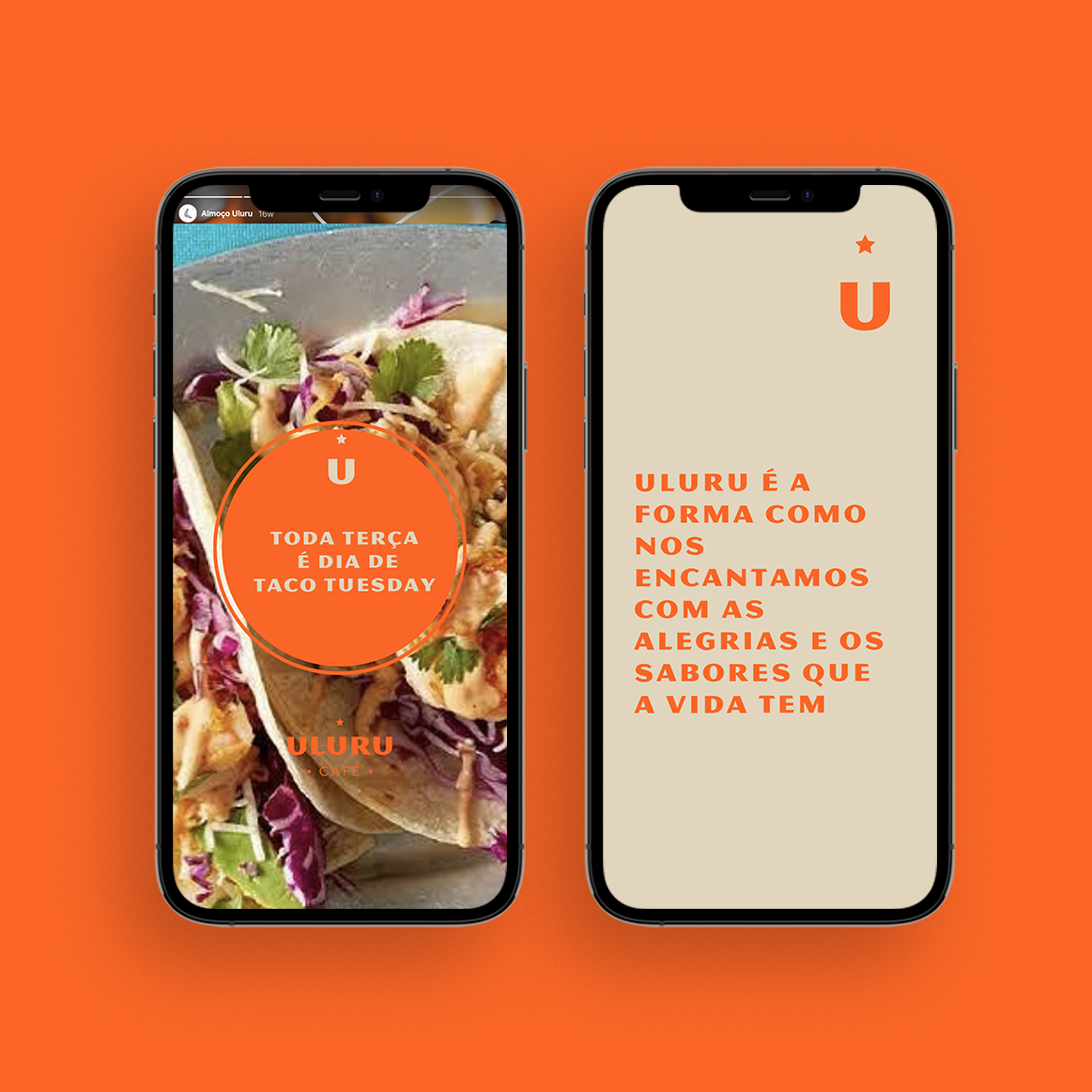
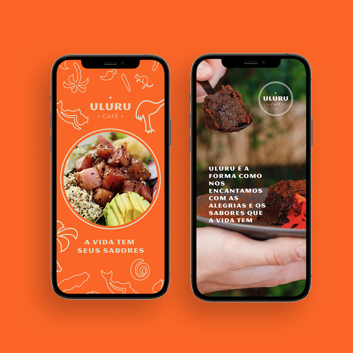
An identity that reflects Uluru’s positioning, spirit and way of being: “to be enchanted by the joys and flavors that life has”.
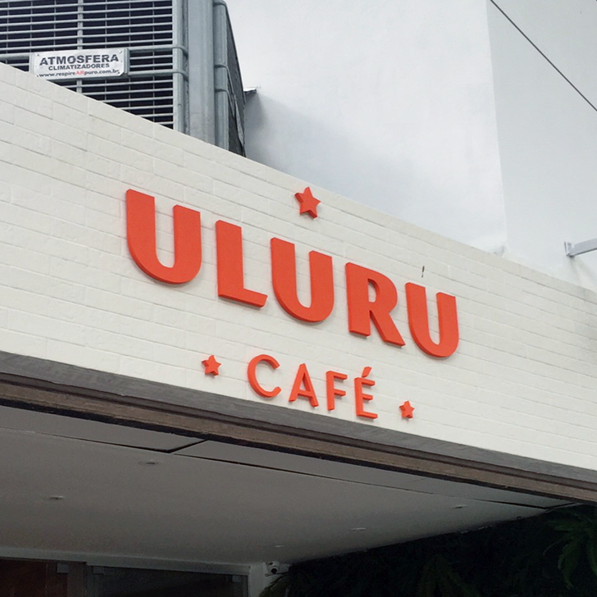
The brand is based on a typography that expresses a joyful and high-vibration energy, translating all the sophistication, vision and proposal of the café.
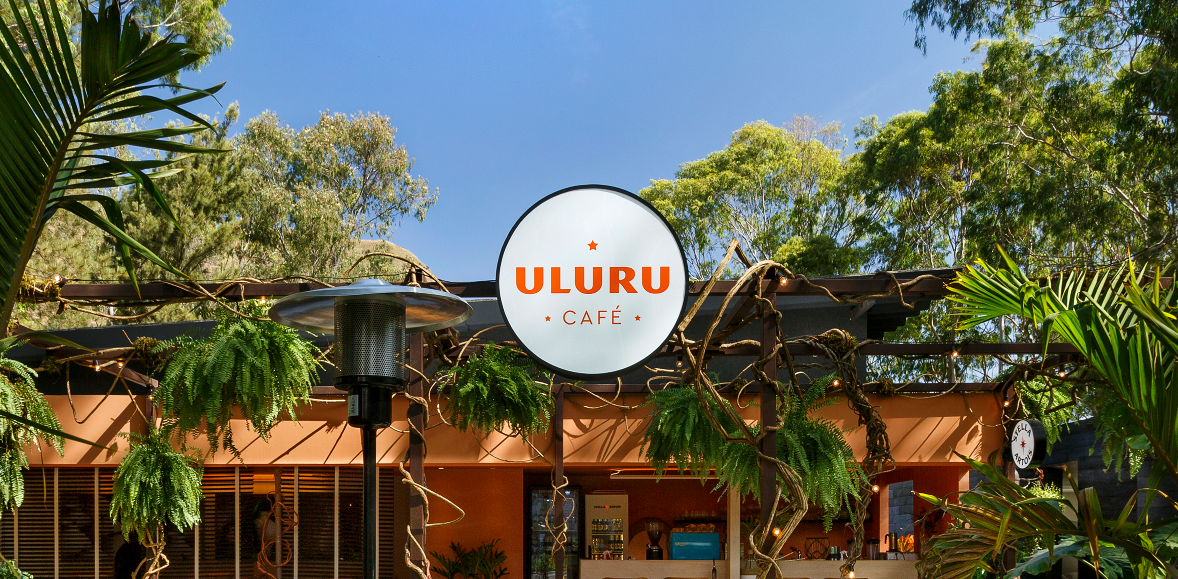
It is accompanied by the symbol of a star, representing the desire to continue flying high and serving as a reference for meetings and moments of fun for all its audience.
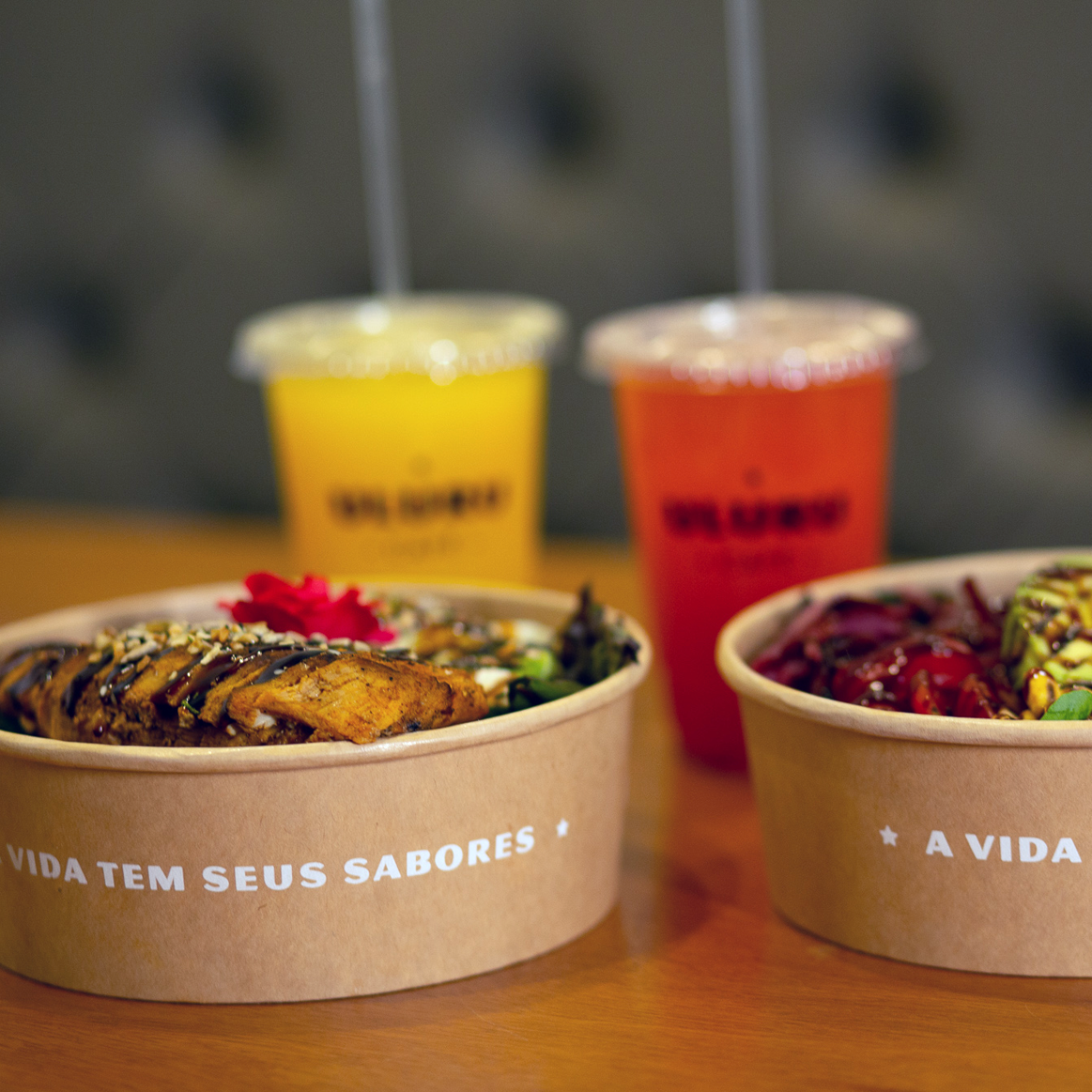
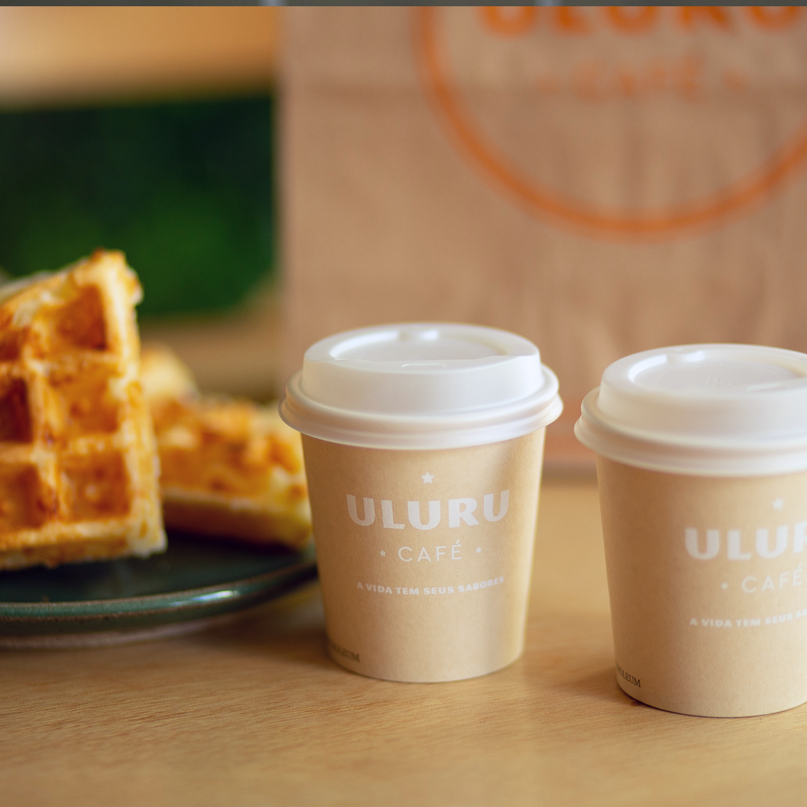
The slogan that accompanies the brand is “The flavors that life has”, because, in fact, being enchanted by the joys and flavors that life has is the best way to live it.
The identity project extends to signage, packaging, digital and printed materials.
